|
Greater Atlanta Coin Show |
||
| coin show and coin information for collectors and investors | ||
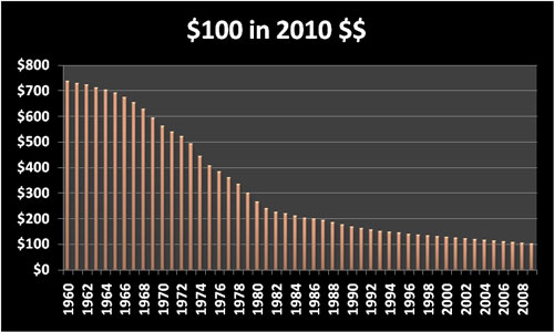
Coins - Cost of Living Charts through the Proof Set YearsCollectors whether they collect numismatics, antiques, toys or whatever intrigues them always seem fascinated with history not only of their collectible but also of the time frame the collectible was first introduced. For fun, we've added historical tidbits to each of the proof set pages, however here, we've collected some of the cost of living statistics in charts. These charts provide pictures of cost of living values across time. For more details about the proof sets and other the other historical notes, browse the decades and the individual proof set pages: 1960s, 1970s, 1980s, 1990s and 2000s. First let's look at how many 2010 dollars it would take to buy the same amount of goods as $100 in each of the years.
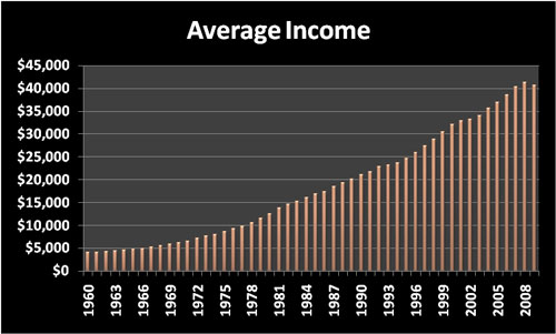
That first bar indicates it would take $736.68 in 2010 dollars to buy the same amount as $100 bought in 1960. Ouch. But, what was the average annual income in those years?
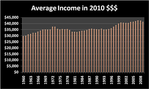
Disregarding the dip in 2009 for a minute, did the average annual income steadily climb from 1960 to 2002? Let's look at the average annual income in 2010 dollars.
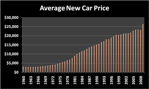
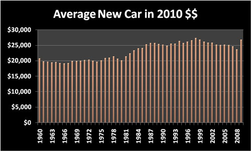
Not only did we have a dip in 1981's average annual income, but we've had other dips in earning through the years when you consider inflation. Using this same exercise, take a look at the average cost of a new car through these years.
This chart not only includes the growth in the cost of the average new car but also the changes in consumers' interest. Perhaps the change in car buyers' interest can be more readily seen using 2010 dollars.
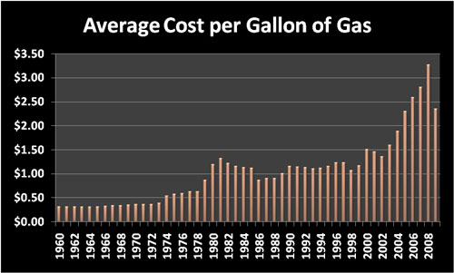
This chart illustrates that the car buyer doesn't always buy the next upwardly expensive model nor do they buy within the same manufacturer. Those vehicles need fuel to run. Let's look at the average gasoline prices per gallon.
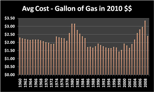
That's an interesting little spike in 1981. Wonder how it will compare when looking at 2010 dollars.
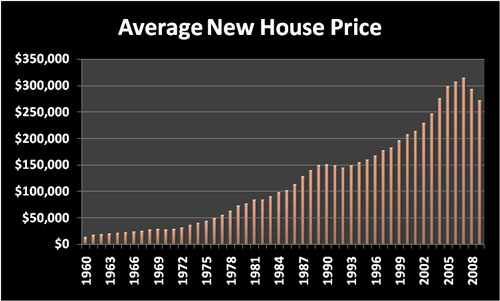
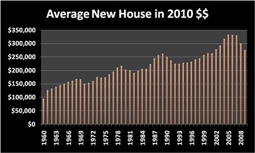
Gas actually incurred some more expensive per gallon prices during the years than these charts show, but these are averages for the year not the peaks. People also need a place to live. Let's look at the new home prices, average again, across this time period.
Again, we have a steadily climbing curve for the most part. But, this chart also includes changes in people's interest in homes, and it also contains some real estate value fluctuations. Let's look at the same information in 2010 dollars.
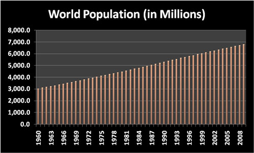
That certainly tells a different story about the rise and dip in average new home prices. Perhaps not a direct cost, however the world's population certainly impacts the cost of living issues. Take a look at the growth in the number of people around the world across these years.
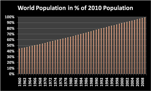
Look closely at the chart. Between 1960 and 2010, the world's population has more than doubled. The increase can be seen more obviously when viewed as a percentage of the 2010 world population.
Looking at the two charts, the world's population grew over 125% from 1960 to 2010. Think about it, that's a lot of growth in 50 years. The next time you look at a proof set, an antique, an old toy or whatever your collectible interest, take a moment to think about how world and the associated cost of living have changed since the collectible was new. In the meantime, browse the individual proof set pages through the decades: 1960s, 1970s, 1980s, 1990s and 2000s for these cost of living and other interesting historical notes along with pictures and descriptions of the proof sets. Resources:
|
Coin Shows GACS Numismatic Shoppe Contact Us Privacy Site Map |
© Copyright Atlanta Coin Expositions, 2008-2016. All Rights
Reserved.
Several of the links on the pages within this web site go to affiliate vendors.
A vendor affiliation can mean a small monetary compensation to the web site owner.

